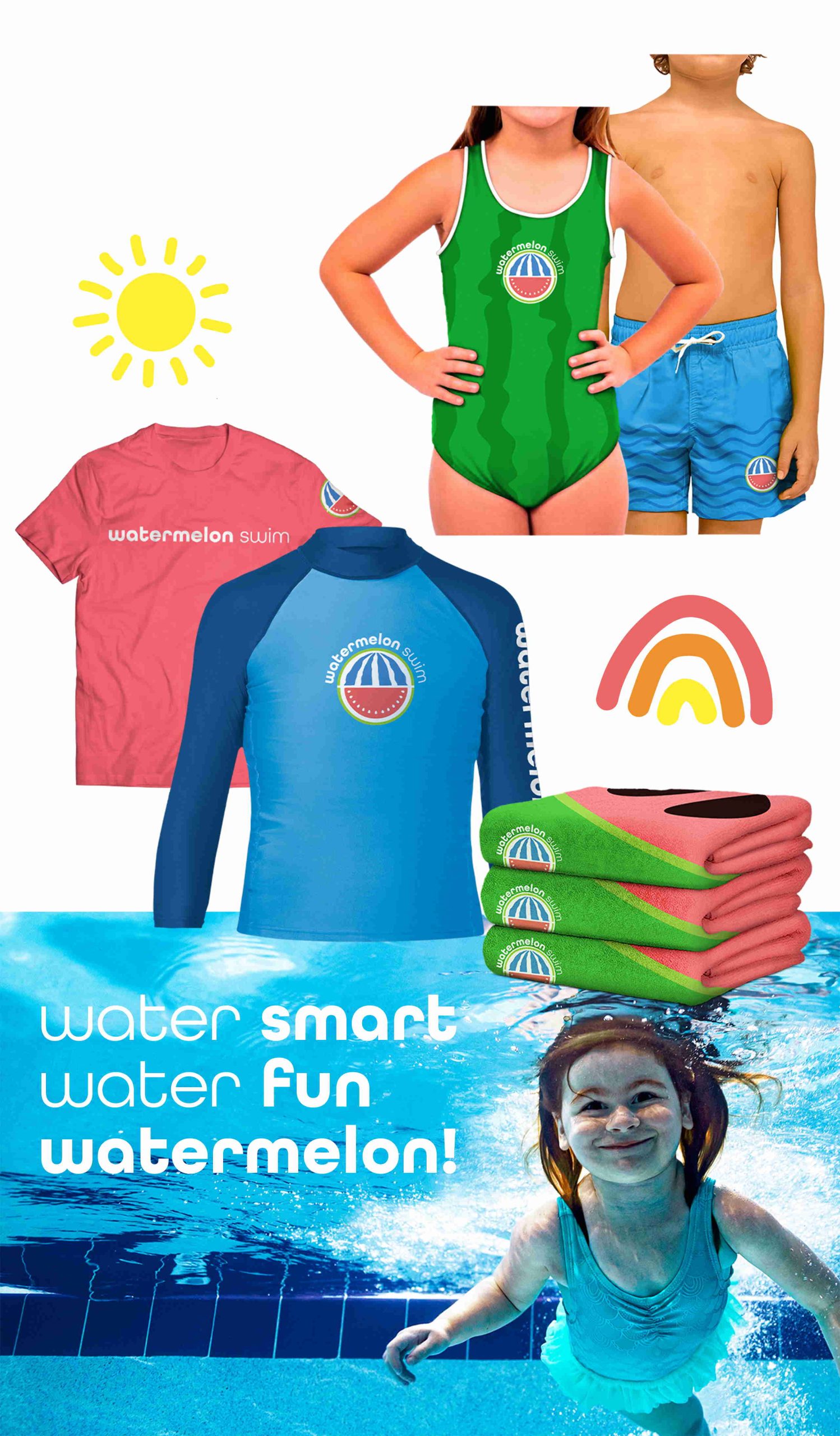
Teaching children water safety and survival skills is all to create a responsible love for the water. Which ultimately translates to having a blast! So we put bright and energetic colors, bold patterns, and fruity iconography at the center of our design. Then, we paired it with watermelon-inspired turns of phrase to make our copy stand out and plant the seed in consumers’ minds.
Background
When the region's most highly regarded swim and safety academy came to us looking for a complete rebrand, we jumped right in. But the new brand name they brought to the table presented some challenges. Watermelon Swim... how were we going to bring this quirky new brand to life and "make a splash" in the market?
-
Client
Watermelon Swim
-
Industry
Swim School
-
Services
Logo Development
Brand Identity
Location Signage
Merchandise Development
Character Illustration
Website Development
Integrated Media
Challenges
Watermelon Swim? Watermelon? Swim?
Our main challenge was to create a connection between a fresh, new element (watermelons) and the client’s well-established mission of water safety and swim education. Then, we needed to make Watermelon Swim a brand that grows on you.
Solution
Focus on the fun.

logo
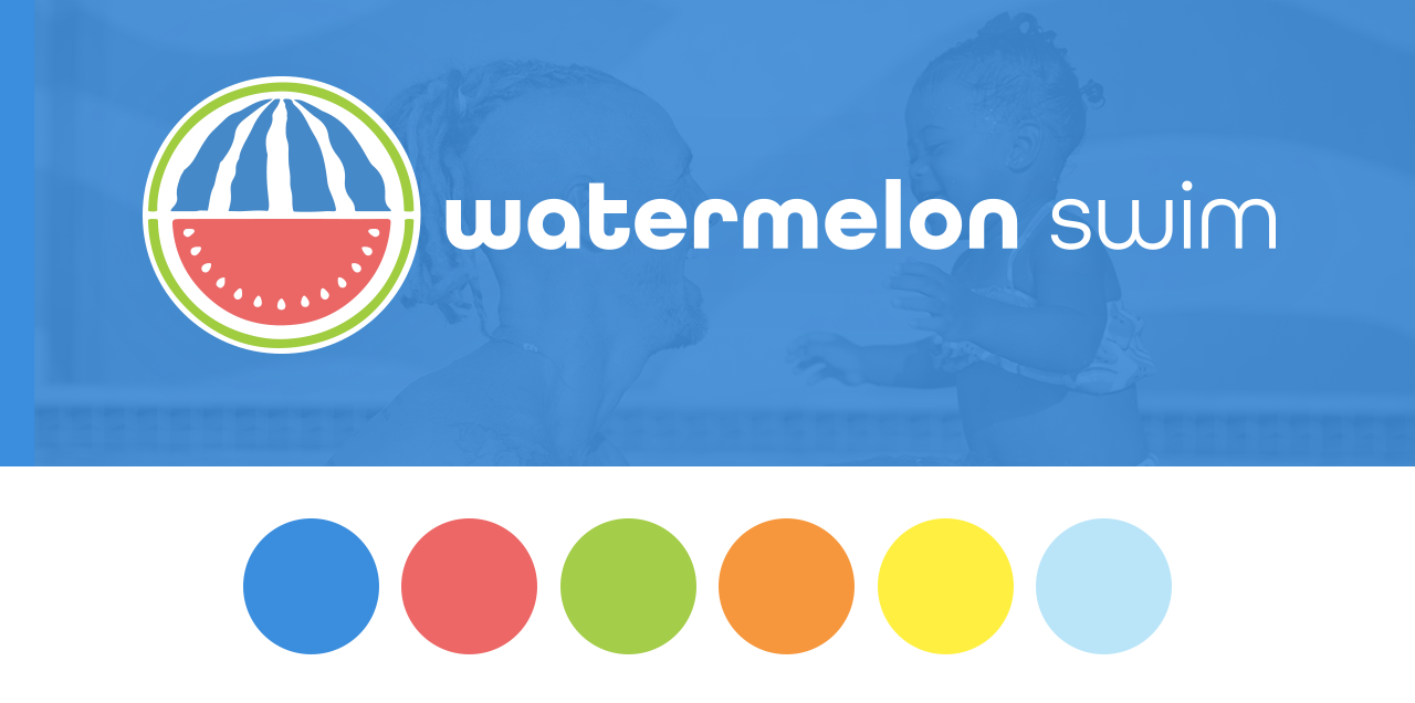
When the client presented us with their initial logo design, we saw the opportunity to make a few refreshing changes. Our final logo combines watermelon elements with the organic feel of flowing water, all presented in invigorating brand colors.
photography
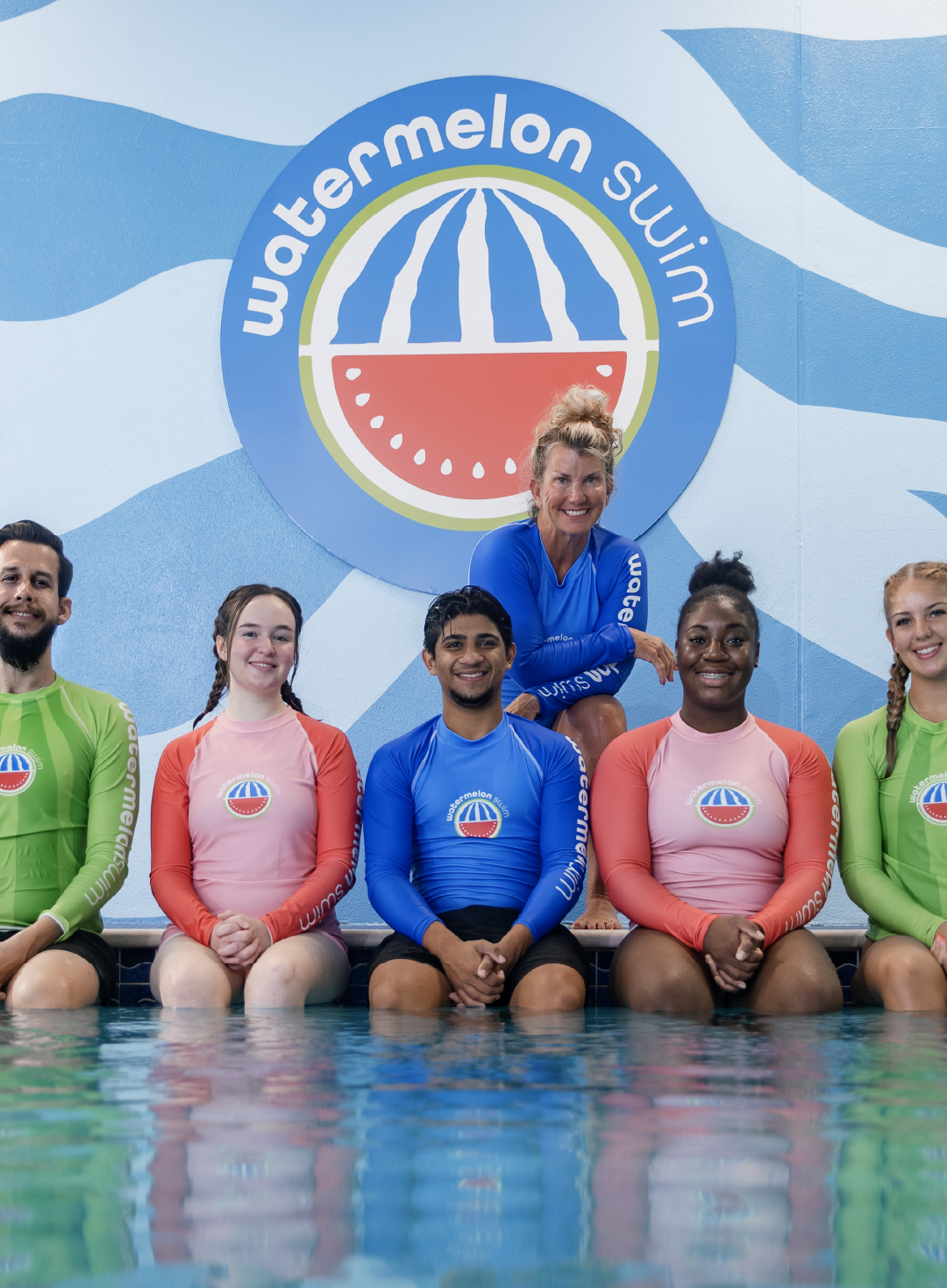
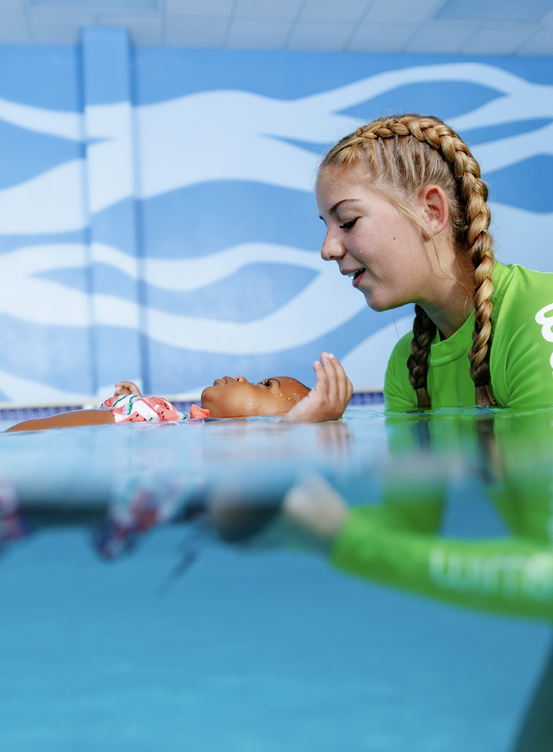
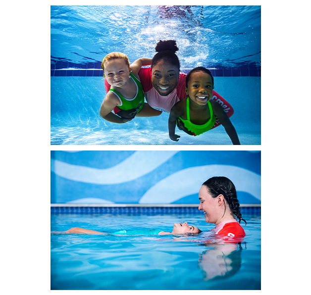
What’s more authentic than real students and instructors having lots of fun? For our brand photography, we knew we needed to portray the heartfelt enthusiasm of both the client’s ethos and the new brand spirit. So we gathered existing members of Team Melon and sent out the call for parents and their swimming seedlings. The result? A colorful underwater story of education and exciting experiences.
Website
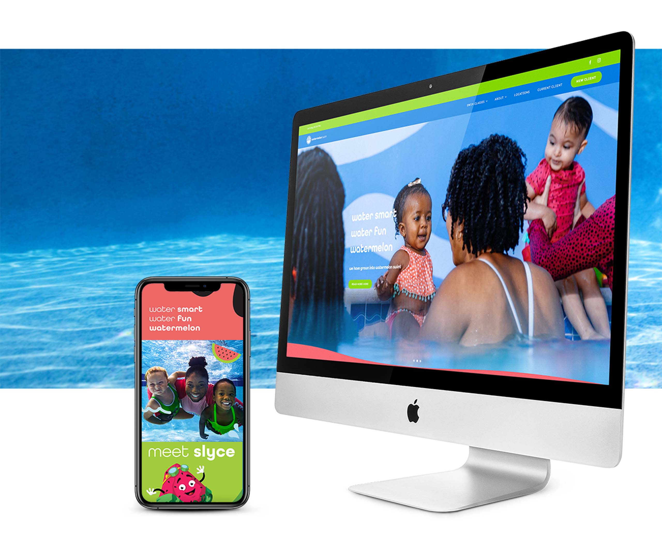
We just couldn’t wait to breathe bright, fruity life into the client’s new website. A complete UX overhaul joined with block colors, brand textures, and a cheerful rounded font to create a bold new look that’s easier than ever to navigate. Visitors can clearly see everything Watermelon Swim has to offer and get their little ones signed up in no time.
Characters
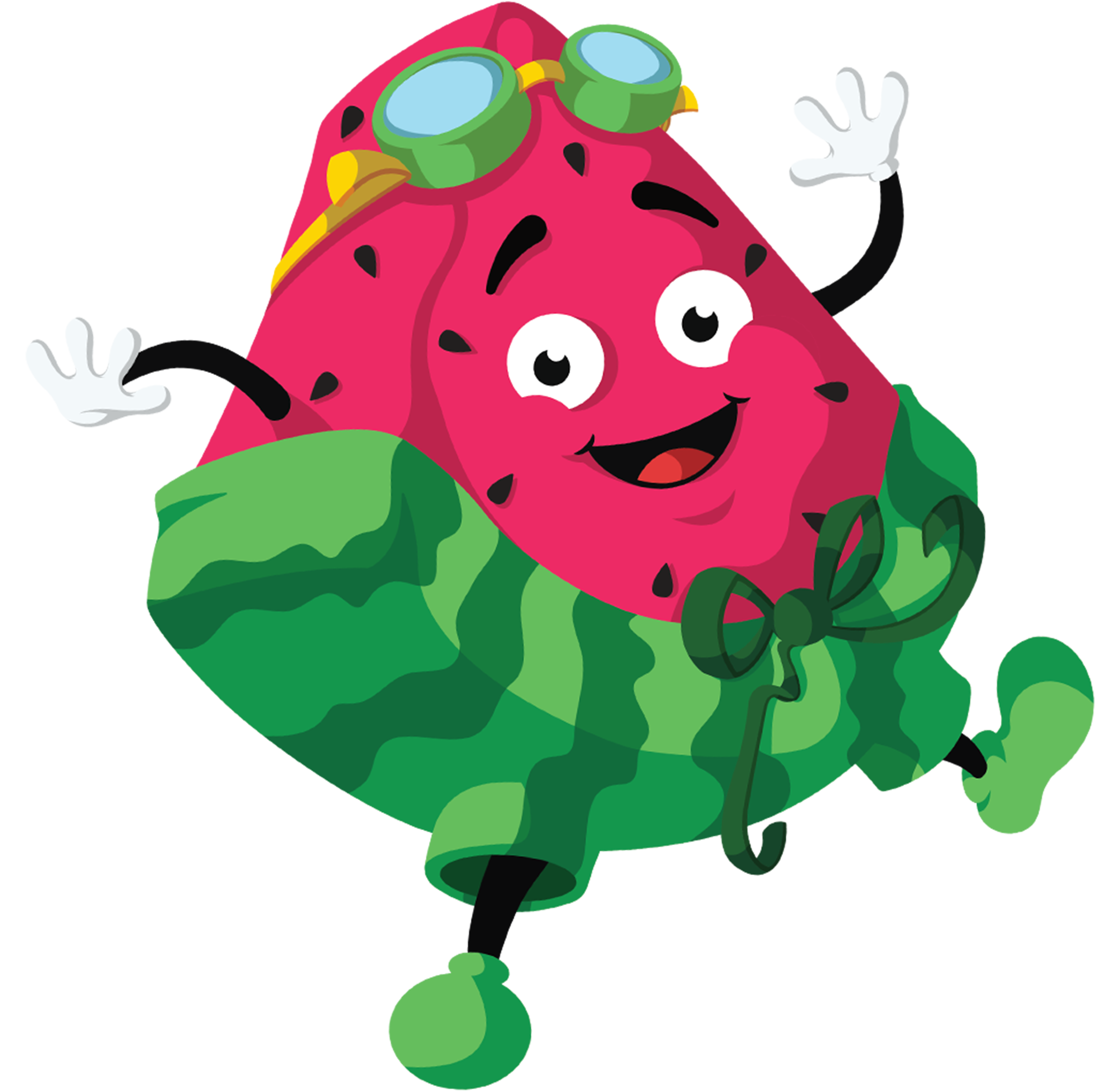
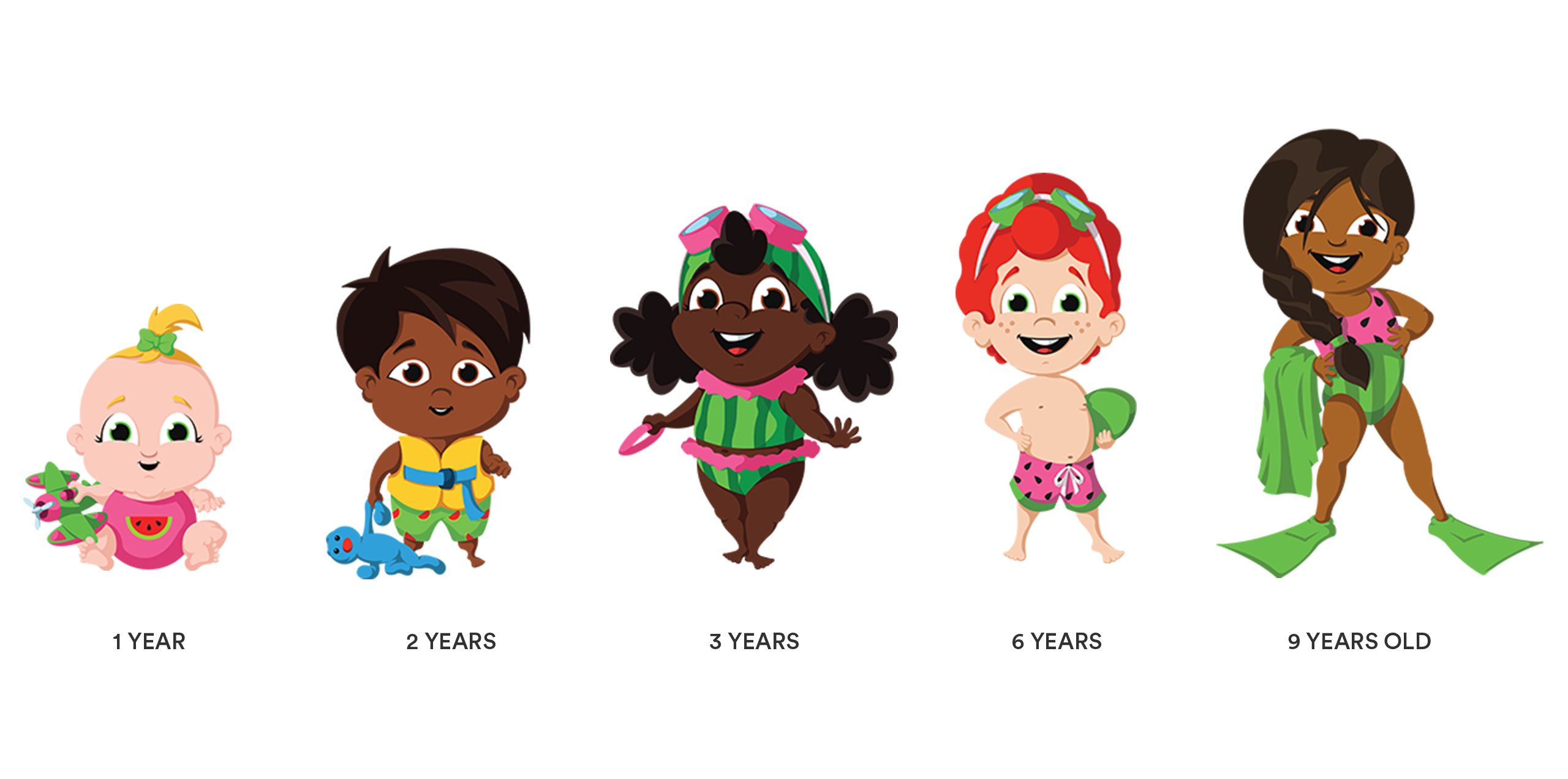
With our other elements in place, it was time for a mascot to embody the Watermelon Swim brand and communicate their core water safety mission. Drumroll please… meet Slyce, our welcoming, wonderful chunk of watermelon whimsy who’s always ready to learn and grow. Slyce leads our diverse cast of illustrated children representing various age and skill levels.
Merchandise
Using our new, refreshed elements, we created merchandise for swimmers of all ages. Whether it’s children still growing their swim skills or the adults cheering them on, anyone can show what makes them One in a Melon with our merch.
